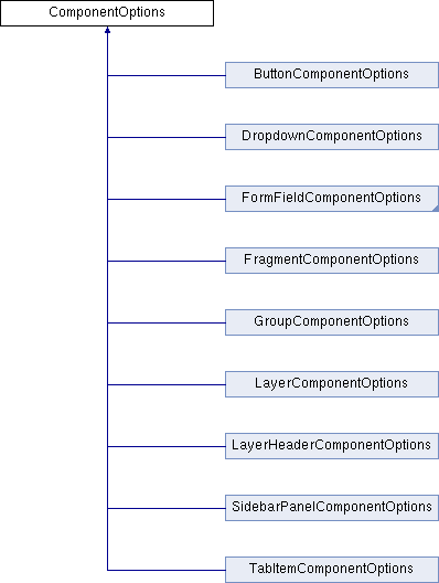
|
FoxitPDFSDKforWeb v11.0.5
Foxit PDF SDK for Web
|
|
FoxitPDFSDKforWeb v11.0.5
Foxit PDF SDK for Web
|
An interface that describes all basic configuration options of a component. More...

Public Attributes | |
| boolean | active = false |
| Initial activation state. More... | |
| boolean | canBeDisabled =false |
| Wheher or not this component can be disabled, if true, disable method will be not working. attribute name in layout-template: can-be-disabled. More... | |
| string | cls = '' |
| Specific a class attribute for the root element of a component. In the fragment config, it is writtern like this: new PDFUI({ fragments:[{ target: 'your component name', config: { cls: 'your-custom-css-class' } },...] }) and in layout-template, it's writtern like the this: <component-type class="your-custom-css-class"> </component-type> . More... | |
| boolean | disabled =false |
| initial disable state More... | |
| boolean | visible = true |
| Initial visibility state, if false, this component will be not displaying on screen after mounted. More... | |
An interface that describes all basic configuration options of a component.
| boolean active = false |
| boolean canBeDisabled =false |
Wheher or not this component can be disabled, if true, disable method will be not working.
attribute name in layout-template: can-be-disabled.
| string cls = '' |
Specific a class attribute for the root element of a component.
In the fragment config, it is writtern like this:
and in layout-template, it's writtern like the this:
.
| boolean disabled =false |
initial disable state
| boolean visible = true |
Initial visibility state, if false, this component will be not displaying on screen after mounted.